Vinyl Album Design


FOLD
Overview












Typographic System
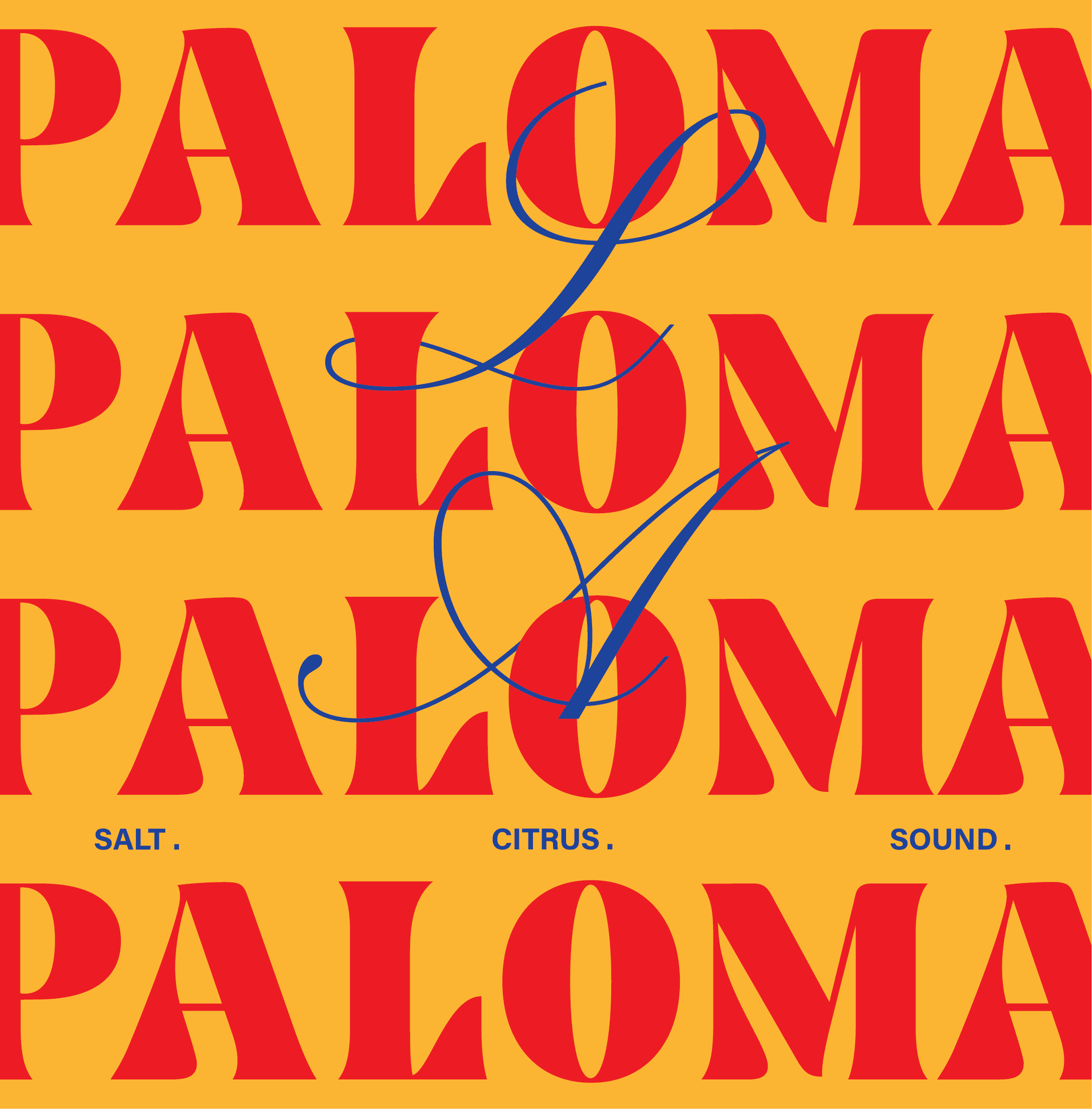
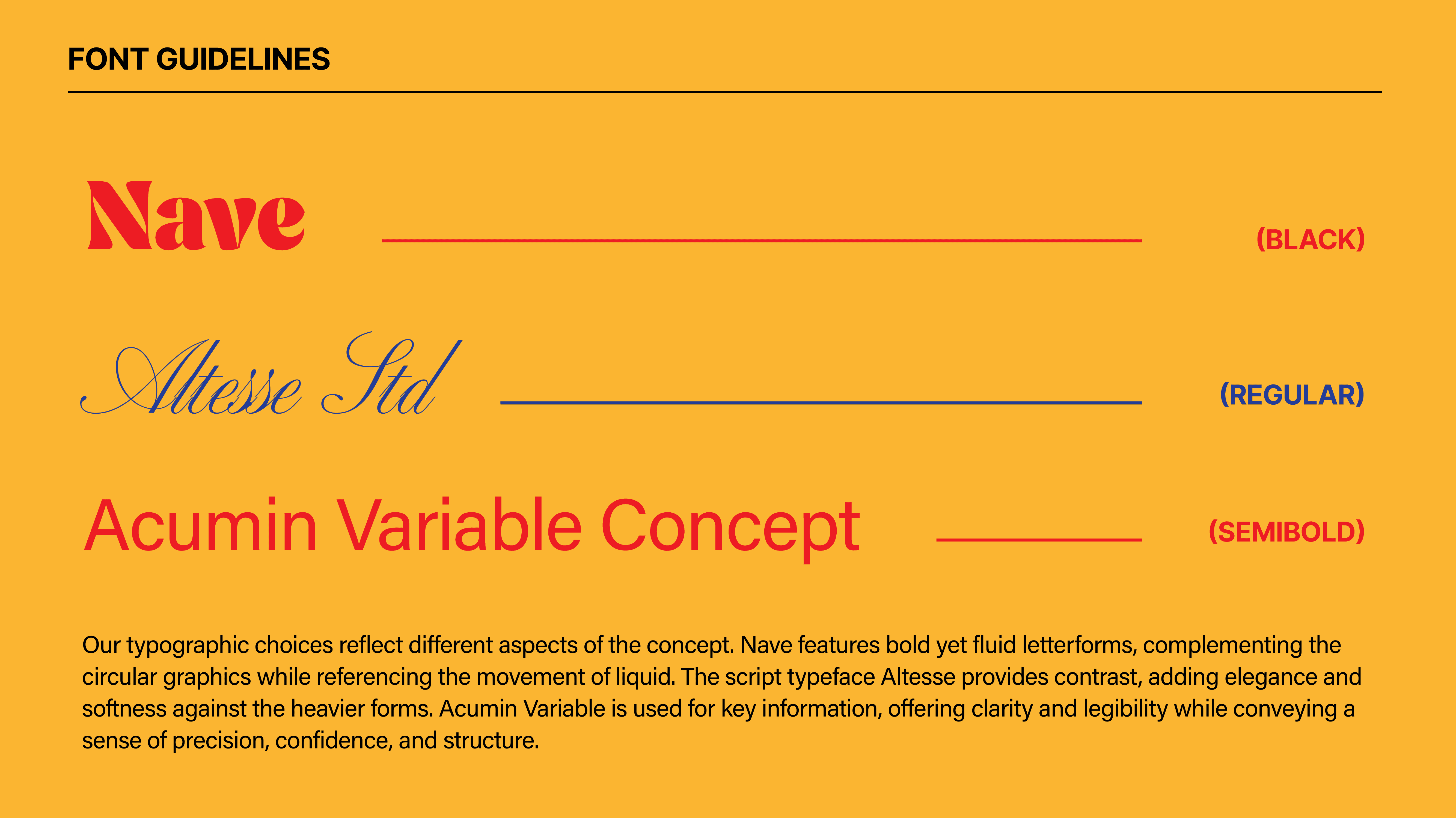
La Paloma’s typographic system combines Nave, Altesse, and Acumin Variable to express the project's sense of contrast. Nave’s bold and fluid letterforms evoke the movement of liquid, while Altesse introduces a softer and more elegant character. Acumin Variable provides clarity and structure for informational content.
Colour Palette
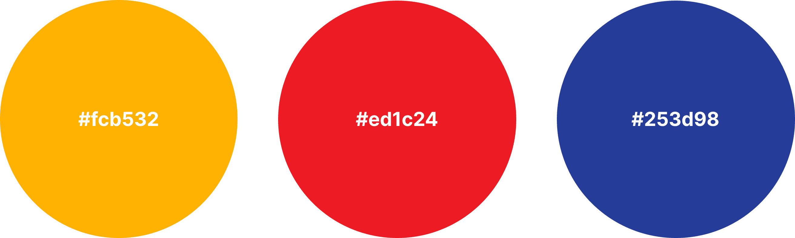
The colour palette draws inspiration from grapefruit, the signature ingredient of the Paloma cocktail. Warm citrus tones are paired with blue accents that reference the sea, creating contrast while reinforcing the project's vibrant summer atmosphere.


Design System
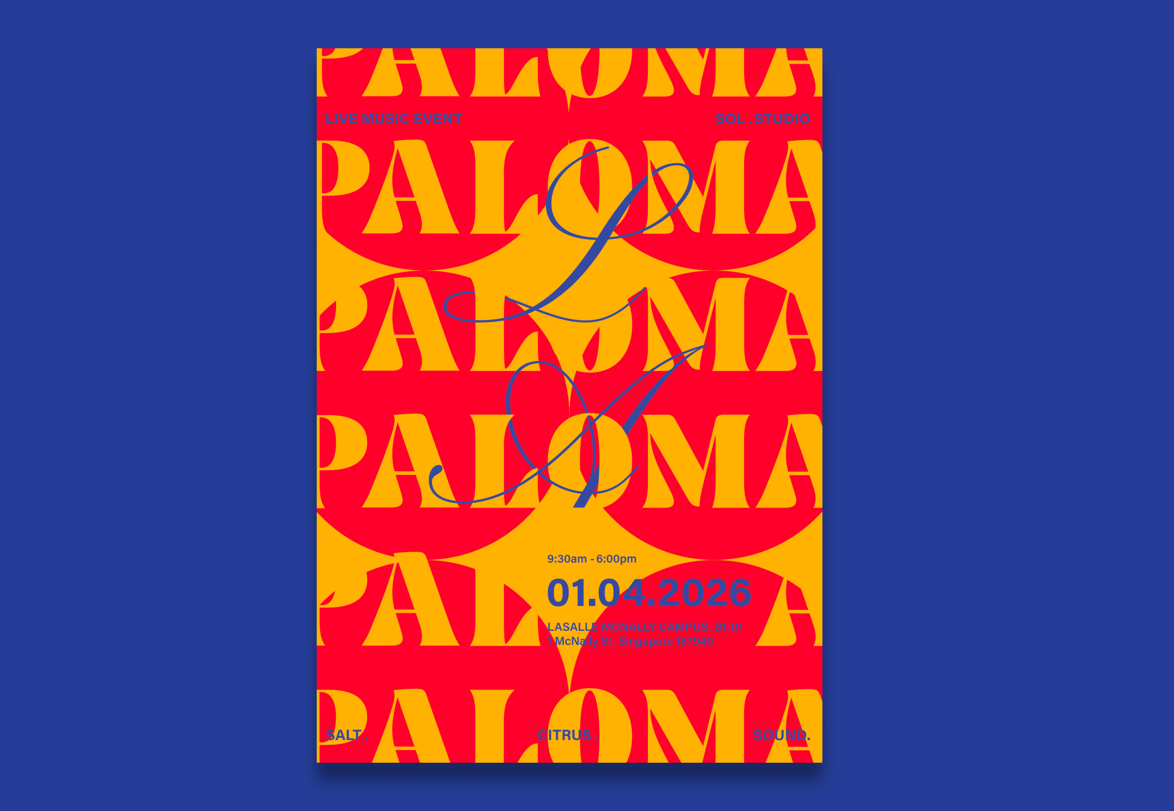
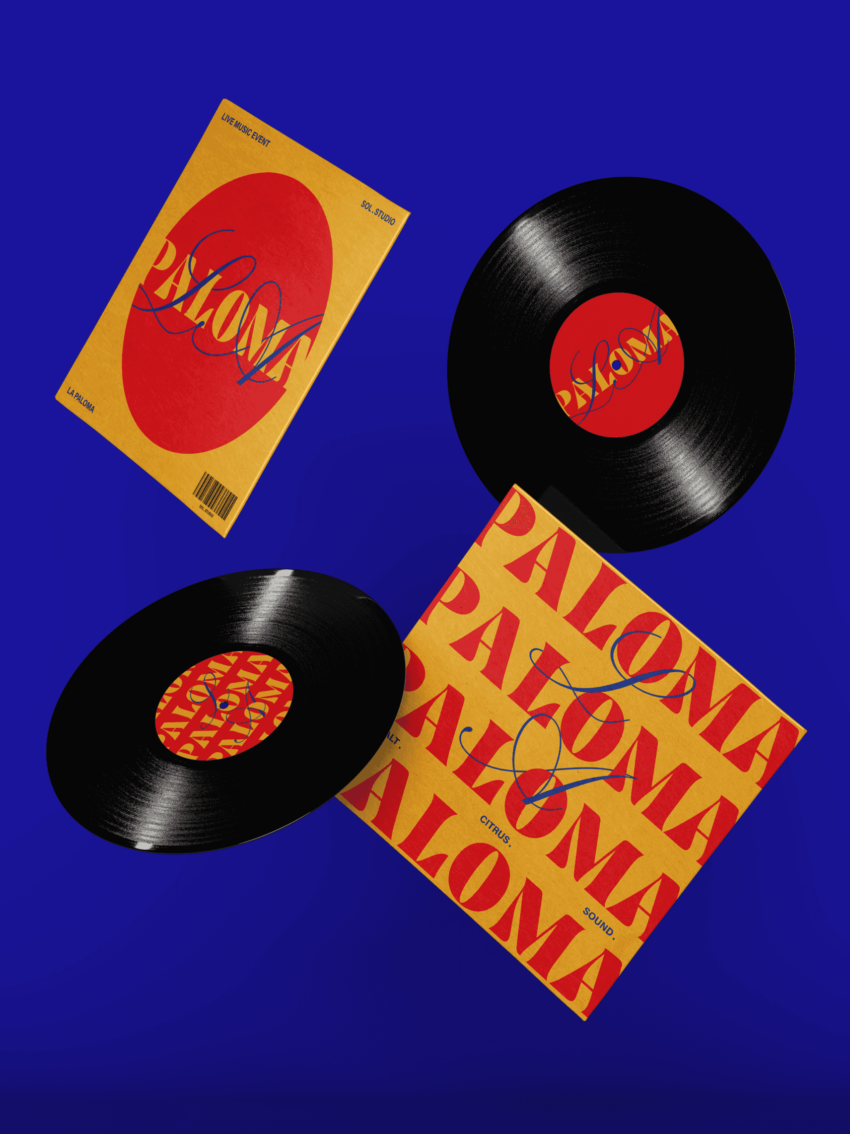
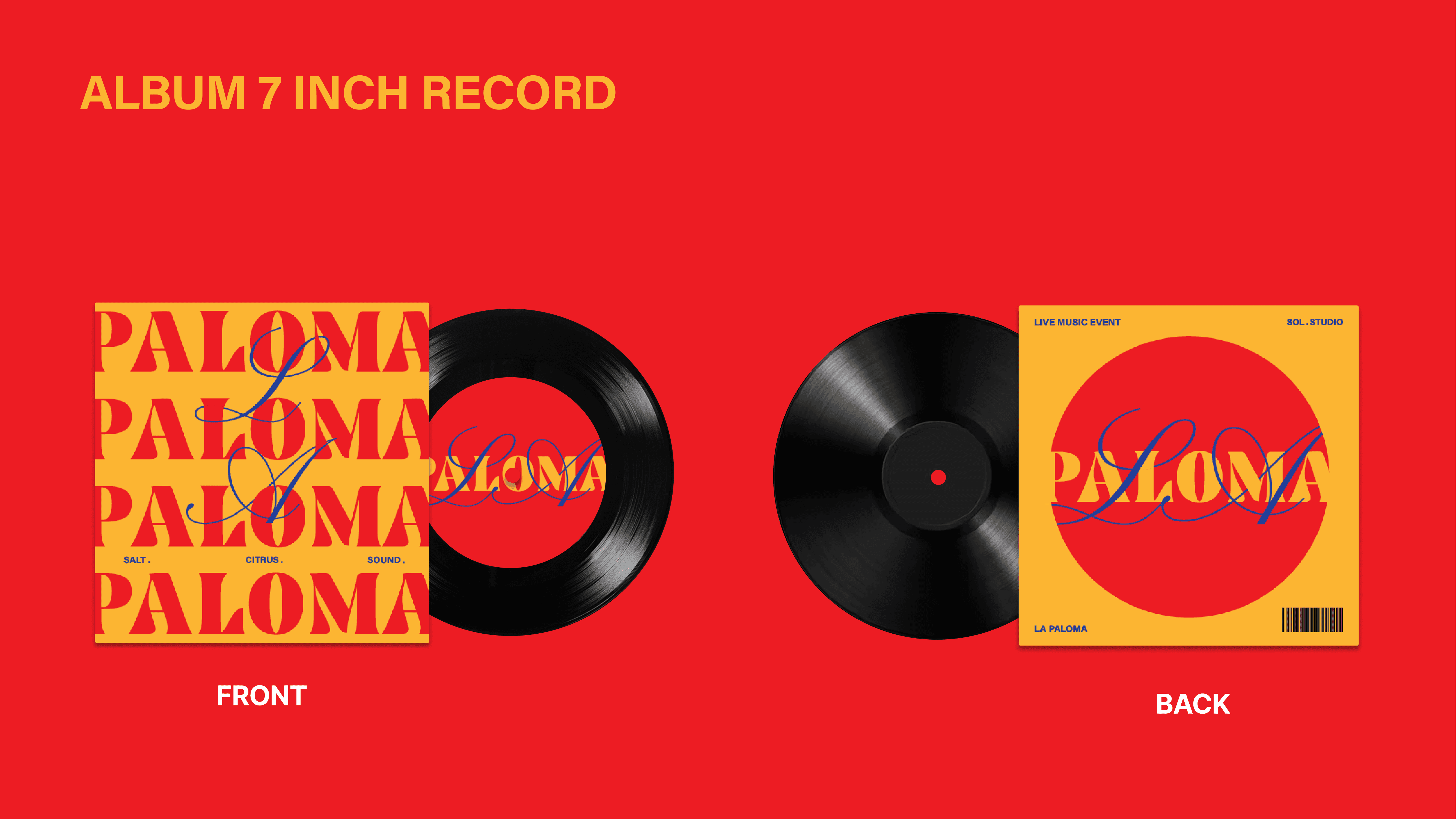
The identity interprets the soundtrack through rhythm, repetition, and typography. Circular forms visualise pulses of sound, while repeating Paloma echoes its cadence. A contrasting script typeface for LA introduces emphasis, resulting in compositions that feel expressive, balanced, and dynamic
Design System

Full Audio
Core Concept
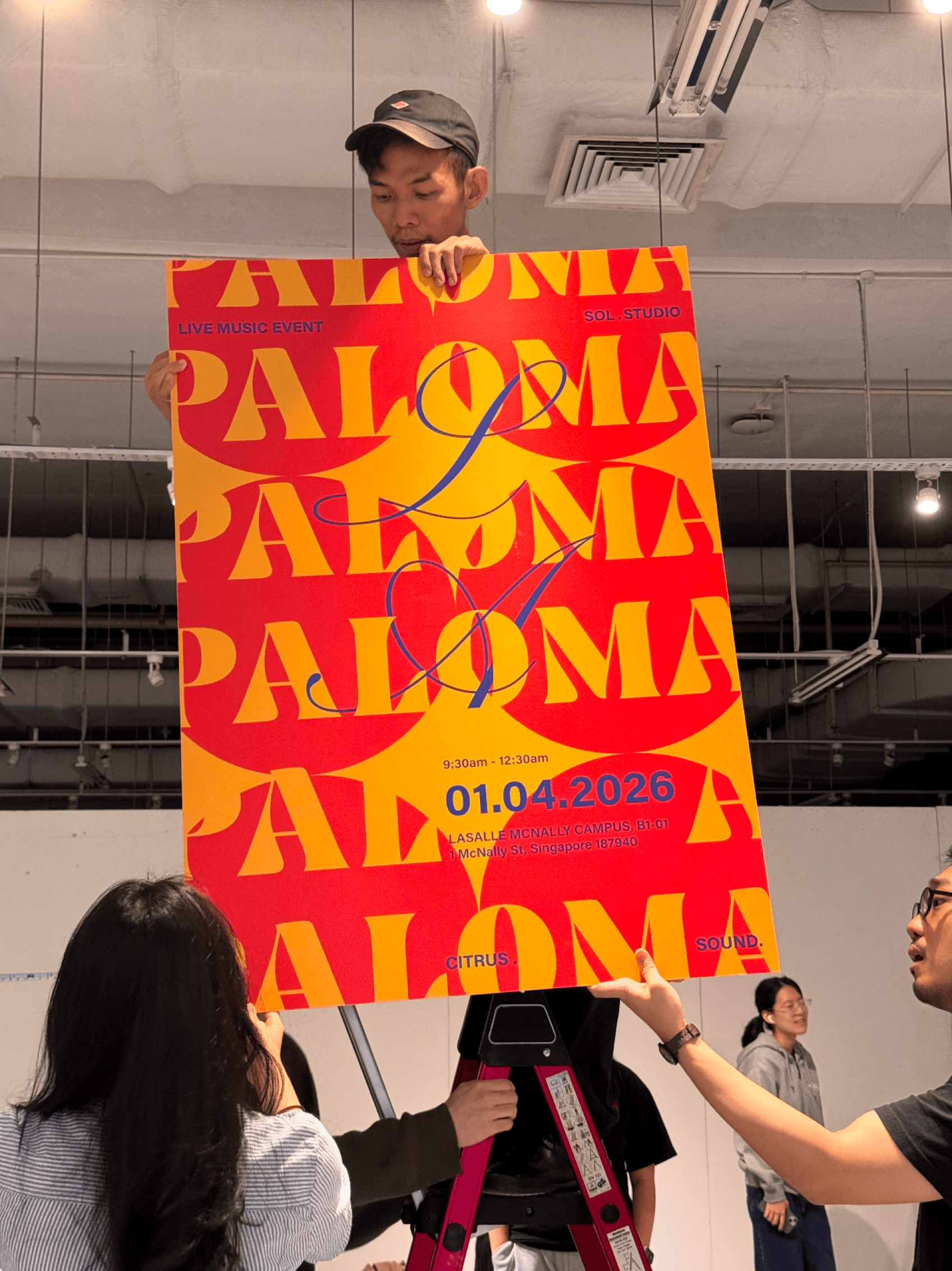
Below: Photographs documenting the poster installation during the Open Studio exhibition setup.


Vinyl Sticker Design


Final Design
Simple design for sticker to make the overall system more refined and less repetitive.
Design 1
Design 2
Graphics for both the Instagram Story and Spotify Canvas are developed from the circular visual language. The dynamic compositions create a lively visual identity that reflects the rhythm and energy of the soundtrack.
Instagram Story & Spotify Canvas






Instagram Story
Spotify Canvas
Promotional Video
On-site Screen Display
Video Mapping
Presentation Slides